Canon Powershot S90 vs IXUS 300HS (Buttons)
Ok. This is part 2 of my first ever review on a camera and to bring it make sense of it all, I'm not going to look into very technical details as I am sure everyone have heard of dpreview.com ;) And I just realised that their office is just 2 tubes away from mine!
Anyway, many users might want to know how user friendly it is using these cameras. Frankly, I'm not the best person to judge this because I've been using Canon since the very first camera I can afford. So User Interface (UI) judgment from me is rather bias. So let's look at the buttons ;)
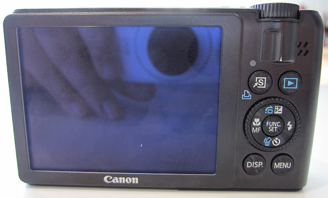
Looks normal right. I mean, you have all the buttons that you will expect. 4 Main Buttons (Shortcut, Play, Display & Menu) and 4 navigational pad with the usual suspects (Macro, Exposure Compensation, Flash and delete/timer). Notice the MF button indicates the Manual Focus toggle which allow users to manually focus the shot especially when shooting under extreme situation where the camera metering doesn't pick up the shot to your preference. And this is something very useful even for amateur like me ;)
Of course, the "Ring" around the navigational buttons are used to scroll thru options and menu. Take note, there's an additional Ring in the front part of the camera which has proven to be very useful among many users. And being the "S" series of the Powershot, both Rings are used collaboratively to ensure user has the best settings on every shot adjusting aperture, shutter speed, exposure, etc using the rings.

However, the scroll ring at the back of the camera is "too loose" and because it's a compact camera I tend to accidentally change the settings thru the loose ring :(

Oh boy. Someone at Canon is trying to be a "minimalist" designer. Looks very clean and simple. Too simple in my opinion. The 2 buttons are the Play and the Menu button. The Scroll Ring is of course for us to scroll thru the menus and settings. What happened to those common buttons like flash settings and the macro on/off button?
Indeed there are! The Scroll Ring is also a 4 way navigational button. It's just that the designer at Canon forgot to put the labels on the camera! Instead, everytime you switch on the camera or when you press the navigational button, the camera will give you an on-screen label telling you what they are. Hmmmmm.....

On the other hand, despite the "almost no friction" scroll wheel on the back of the S90, the front scroll wheel really makes changing settings really easy and feels good. The buttons are big enough even for my fat fingers and the clear labels indicating what they are is a no brainer for me to say, 1-0 to the S90 ;)
So, Round 2 to the Powershot S90, means now we are 1-1! Hope I will make time soon for my next part of the review.
Part #1: Video Quality
Anyway, many users might want to know how user friendly it is using these cameras. Frankly, I'm not the best person to judge this because I've been using Canon since the very first camera I can afford. So User Interface (UI) judgment from me is rather bias. So let's look at the buttons ;)
1) Canon Powershot S90

Looks normal right. I mean, you have all the buttons that you will expect. 4 Main Buttons (Shortcut, Play, Display & Menu) and 4 navigational pad with the usual suspects (Macro, Exposure Compensation, Flash and delete/timer). Notice the MF button indicates the Manual Focus toggle which allow users to manually focus the shot especially when shooting under extreme situation where the camera metering doesn't pick up the shot to your preference. And this is something very useful even for amateur like me ;)
Of course, the "Ring" around the navigational buttons are used to scroll thru options and menu. Take note, there's an additional Ring in the front part of the camera which has proven to be very useful among many users. And being the "S" series of the Powershot, both Rings are used collaboratively to ensure user has the best settings on every shot adjusting aperture, shutter speed, exposure, etc using the rings.

However, the scroll ring at the back of the camera is "too loose" and because it's a compact camera I tend to accidentally change the settings thru the loose ring :(
2) Canon IXUS 300HS/ Powershot SD4000 IS

Oh boy. Someone at Canon is trying to be a "minimalist" designer. Looks very clean and simple. Too simple in my opinion. The 2 buttons are the Play and the Menu button. The Scroll Ring is of course for us to scroll thru the menus and settings. What happened to those common buttons like flash settings and the macro on/off button?
Indeed there are! The Scroll Ring is also a 4 way navigational button. It's just that the designer at Canon forgot to put the labels on the camera! Instead, everytime you switch on the camera or when you press the navigational button, the camera will give you an on-screen label telling you what they are. Hmmmmm.....

Verdict:
I really like the minimalist design of the IXUS. And the Scroll ring feels much better on the IXUS compare to the S90. But the lack of what we "non-designer" call as "Labels" are really an amusing exception.On the other hand, despite the "almost no friction" scroll wheel on the back of the S90, the front scroll wheel really makes changing settings really easy and feels good. The buttons are big enough even for my fat fingers and the clear labels indicating what they are is a no brainer for me to say, 1-0 to the S90 ;)
So, Round 2 to the Powershot S90, means now we are 1-1! Hope I will make time soon for my next part of the review.
Part #1: Video Quality


Comments
Post a Comment